2023
Aroma
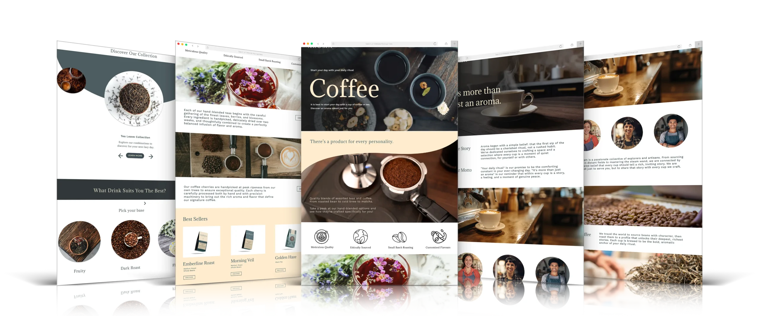
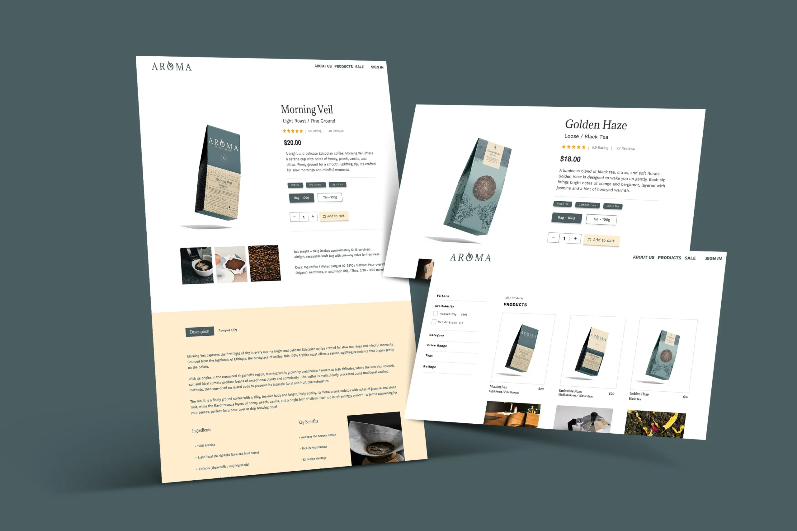
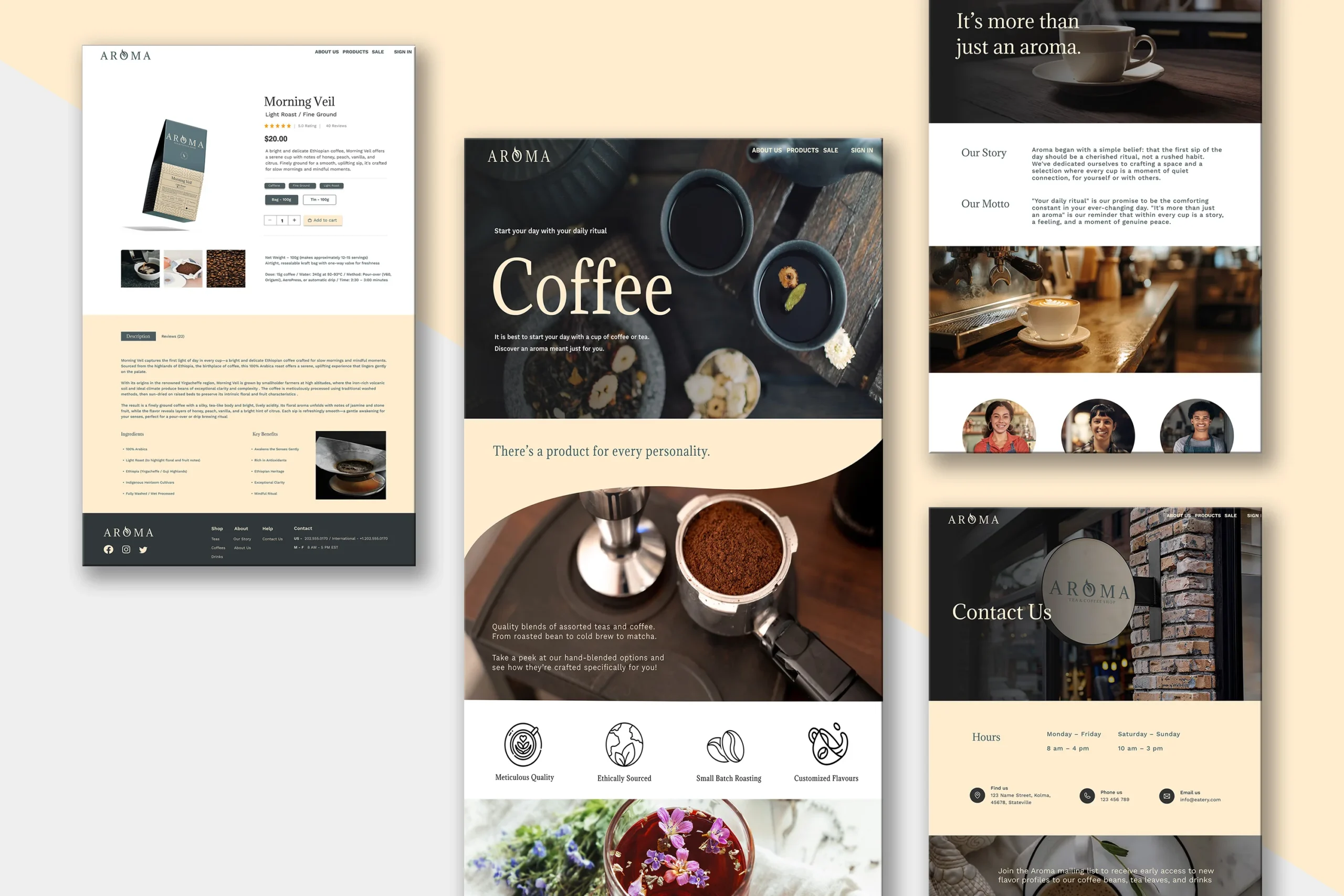
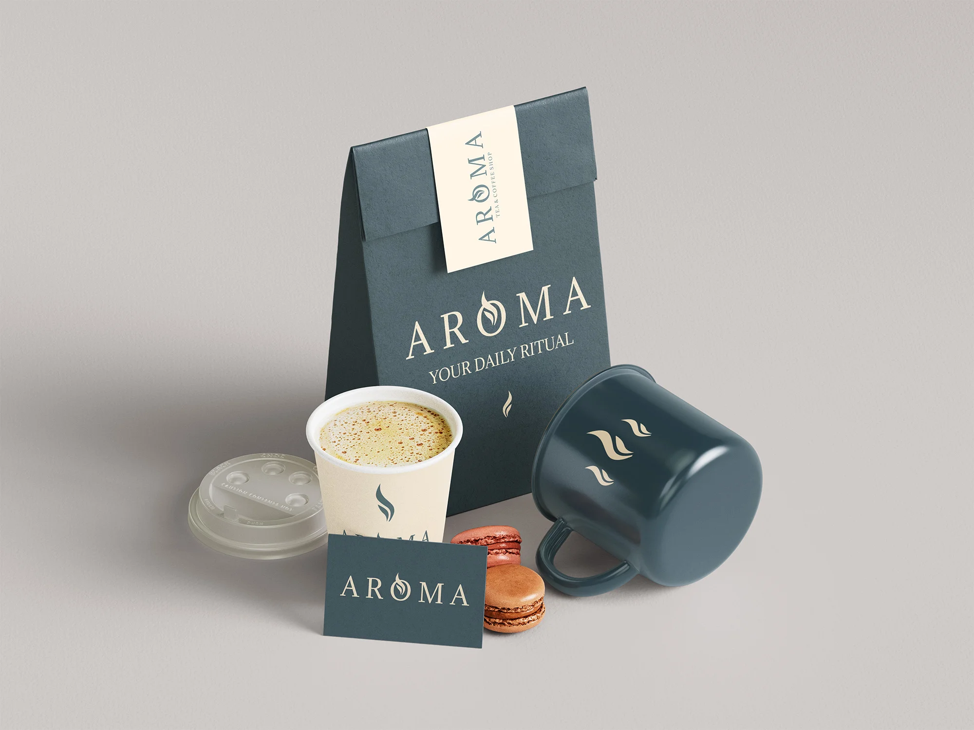
To create a website to not only cater to your tastes but make you enjoy every sip you take. I developed Aroma a beverage brand offering drinks inspired by coffee, tea, and unique blends.
meet the users
I built user personas based on coffee, tea, and matcha drinkers, from caffeine-seekers to those looking for relaxing, low-caffeine alternatives, like matcha. The website and brand are designed for anyone who enjoys a thoughtfully crafted beverage in any way.
influence
coffee drinkers
bold flavors, quick navigation, easy reordering
tea + matcha drinkers
discovery, blend explanations, savory and sweet notes
caffiene-conscious
clear labeling, evening-friendly choices, aroma ad flavors.
Jordan · 29
coffee enthusiast · needs the morning kick
"I know what I like — give me a strong espresso and let me get on with my day."
Sam · 24
matcha lover · curious about blends
"I like trying new things — matcha, herbal teas, unique blends. I want to learn what's out there."
Taylor · 32
decaf · evening tea · mindful drinker
"I love the ritual of a warm drink, but I need something that won't keep me up at night."
user journey
Land on homepage
→
Take personality quiz
→
Get personalized recommendations
→
Browse blends
→
Read about sourcing
→
Select a drink
→
Add to cart
→
Checkout
→
Reorder
The quiz helps users discover drinks based on their taste, caffeine preference, and mood — making every visit feel personal.
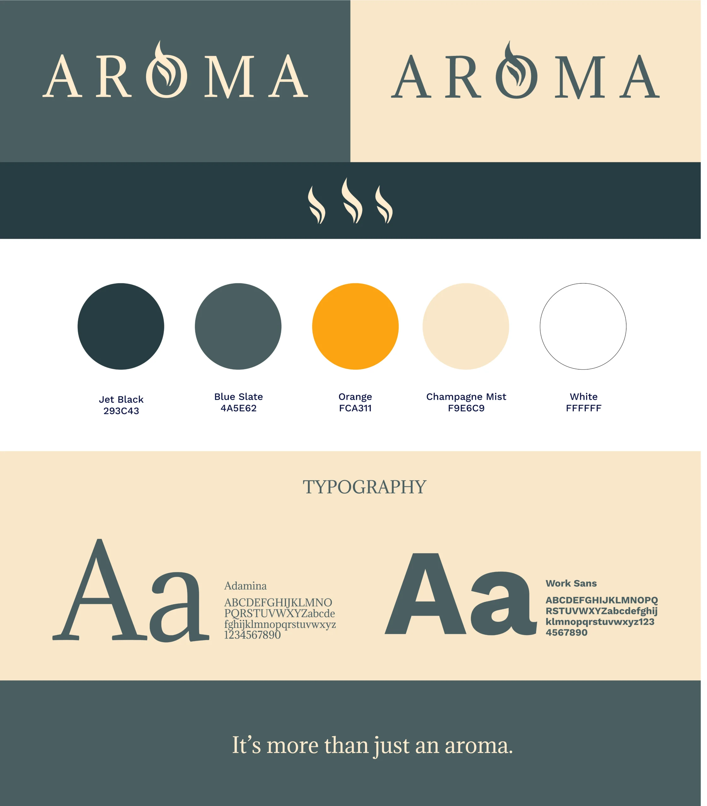
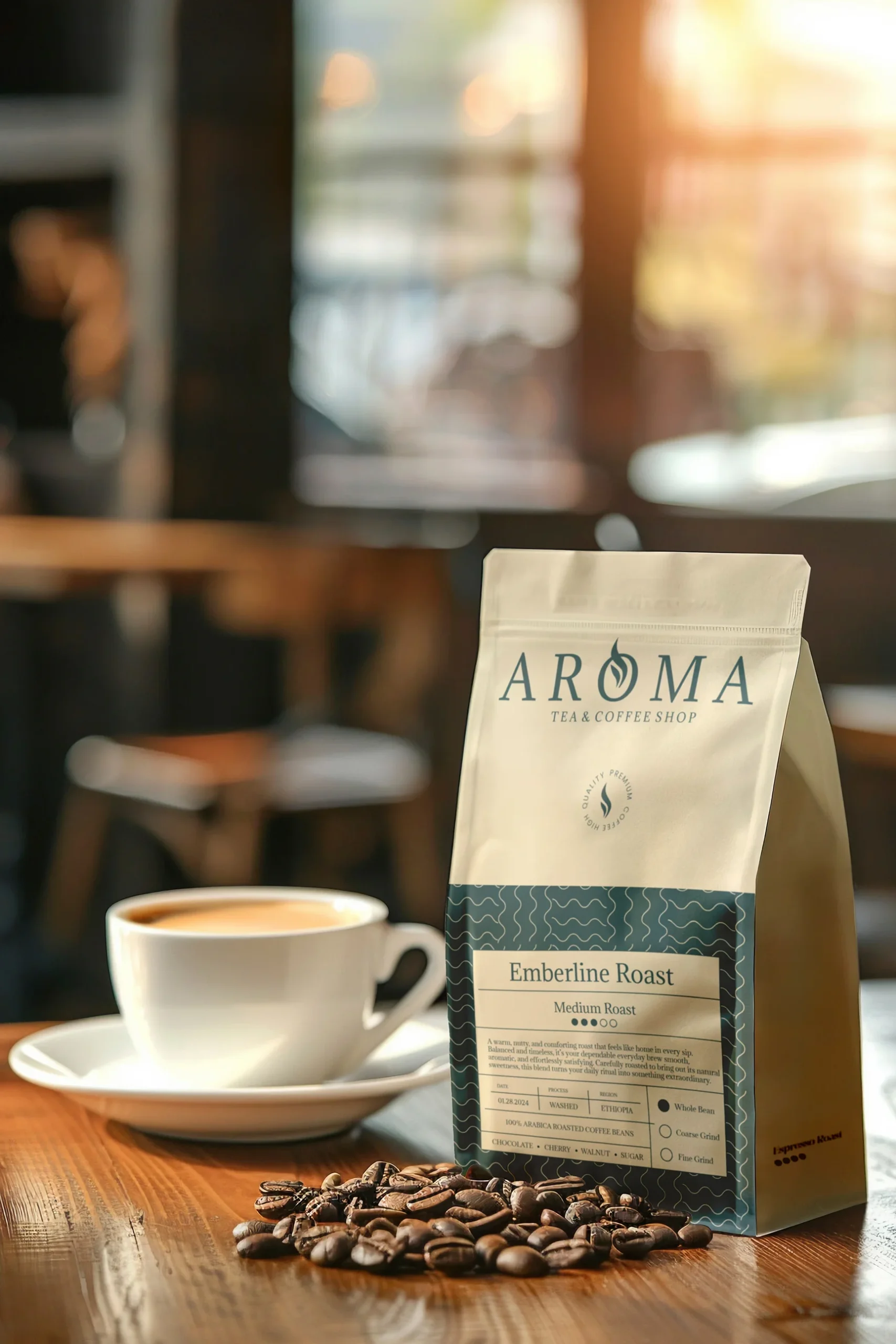
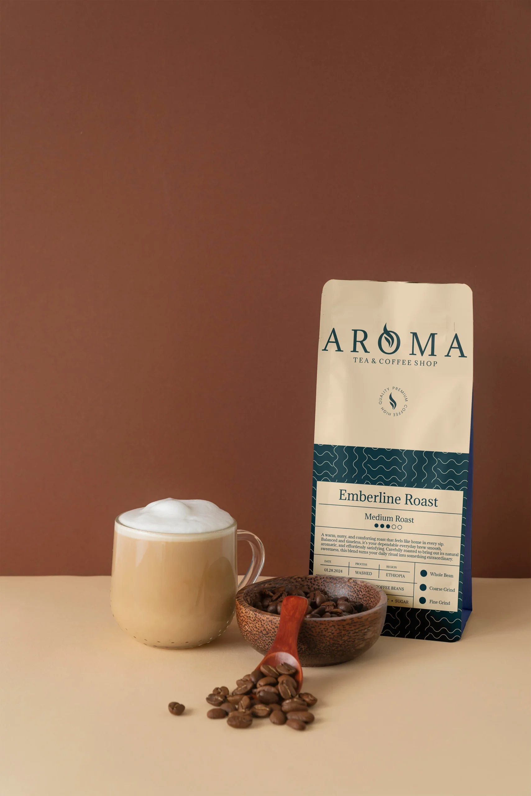
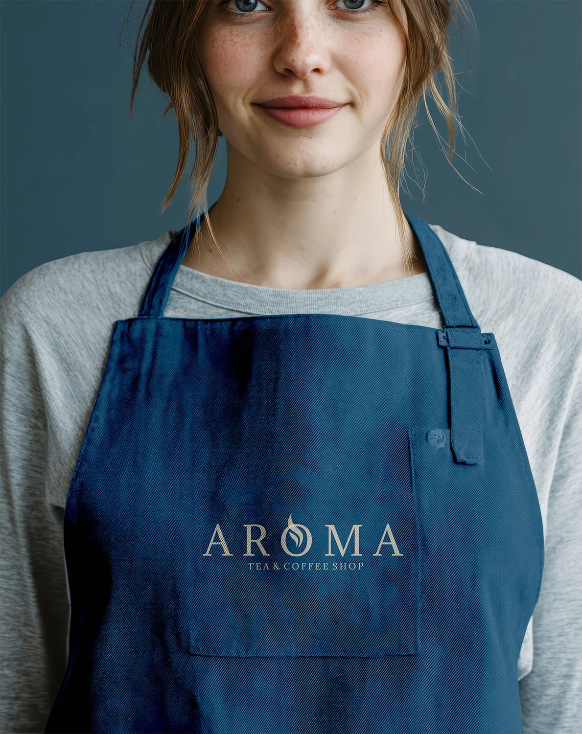
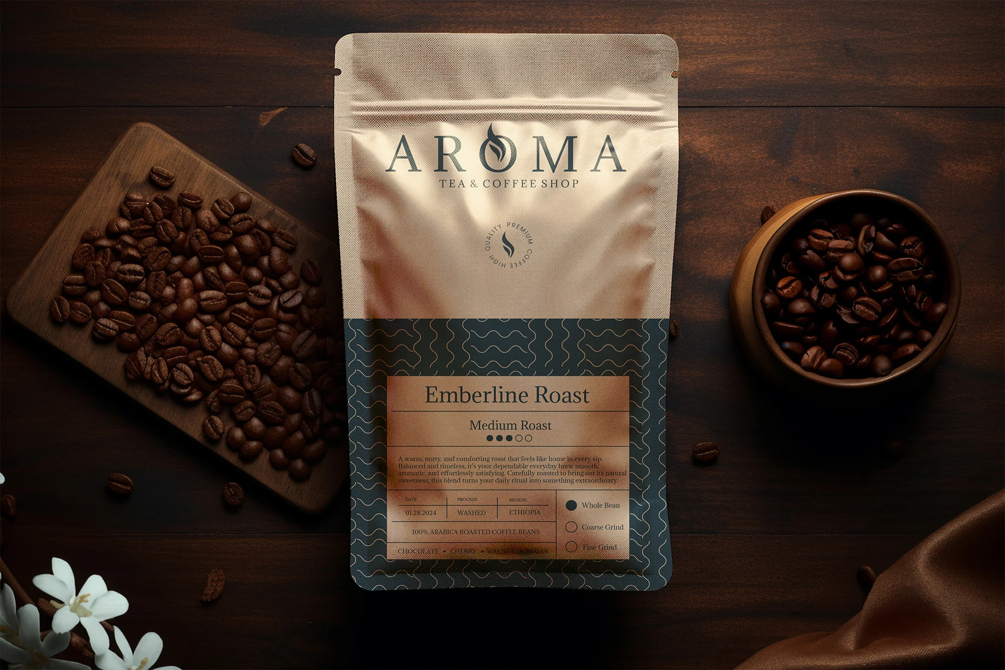
logo + visual imagery
