2024
Apostle
With a task in mind to help solve an issue by creating an app, I focused on people’s struggles to find affordable used clothing that fits their style and budget.
meet the users
I built user personas and journeys based on research into secondhand shoppers and sustainable fashion advocates. The app is designed for young adults who care about style, budget, and the planet.
influence
budget-conscious stylists
affordable fashion, outfit planning, weather-based suggestions
sustainable collectors
secondhand finds, building a conscious wardrobe, reducing waste, and reselling
intentional browsers
discovery over impulse, saving items, thoughtful purchasing
Maya · 24
grad student · budget-conscious
"I want to look good without spending a lot — and I'd rather buy secondhand than fast fashion."
Alex · 28
marketing · sustainable fashion
"I wish there was an easier way to find clothes that actually fit my style, not just endless scrolling."
user journey
Create account
→
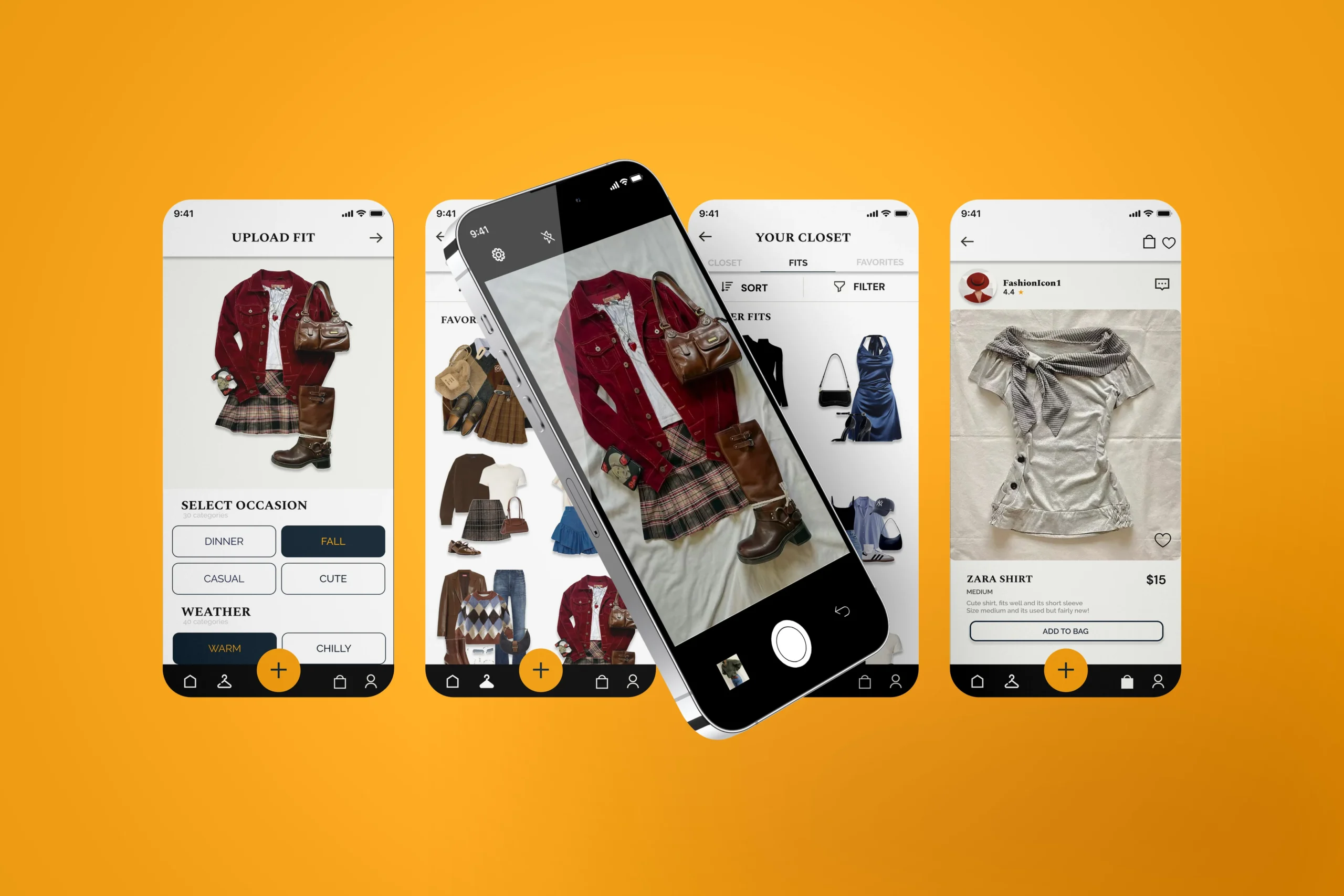
Upload wardrobe
→
Add pieces
→
Personalized homepage
→
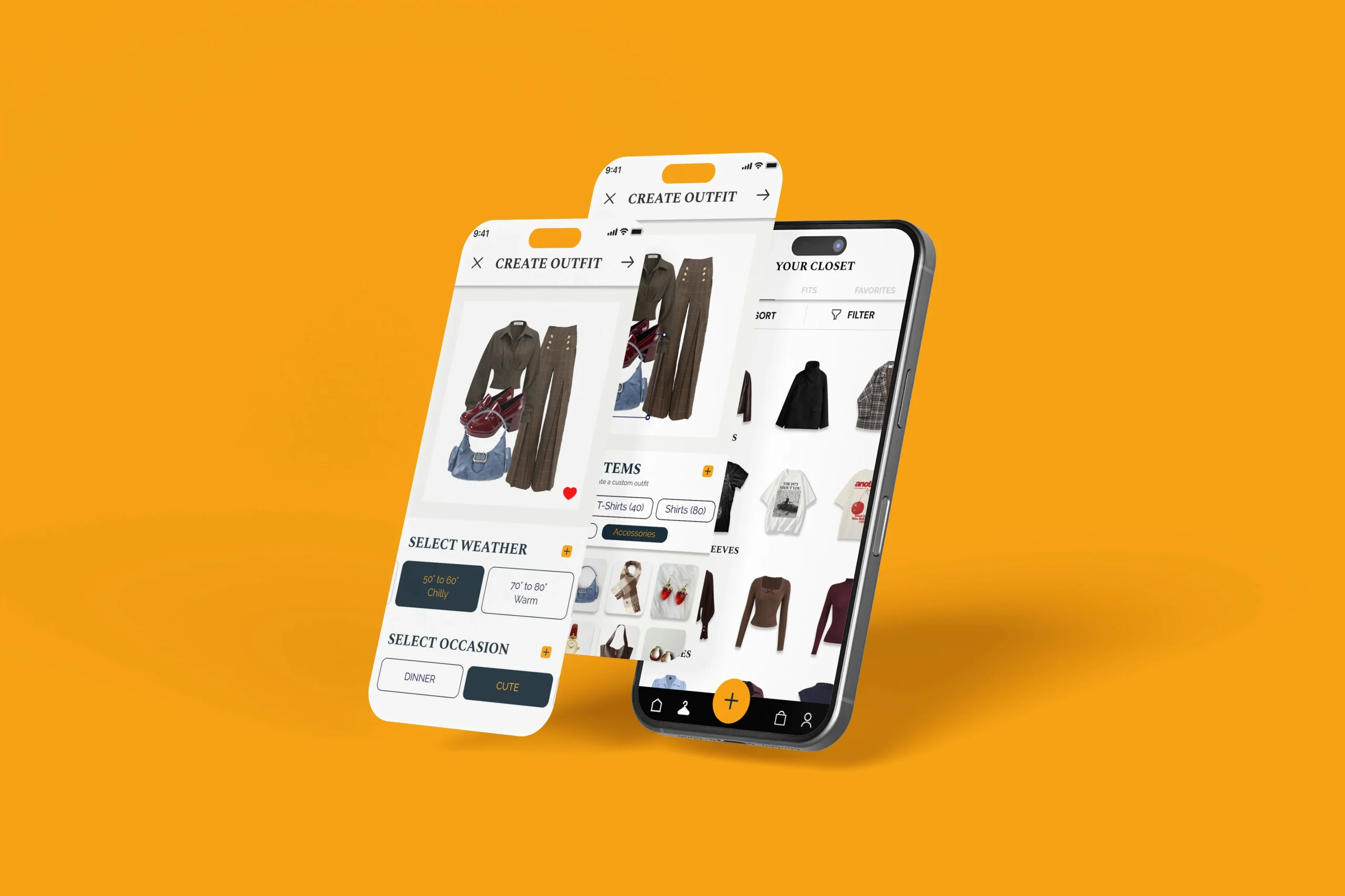
Weather/occasion outfit
→
Browse other items
→
Share outfit
→
Discover clothing
→
Select item
→
Checkout
→
Add to wardrobe
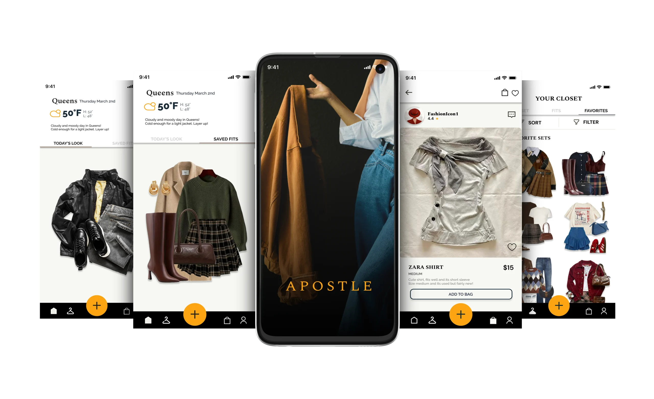
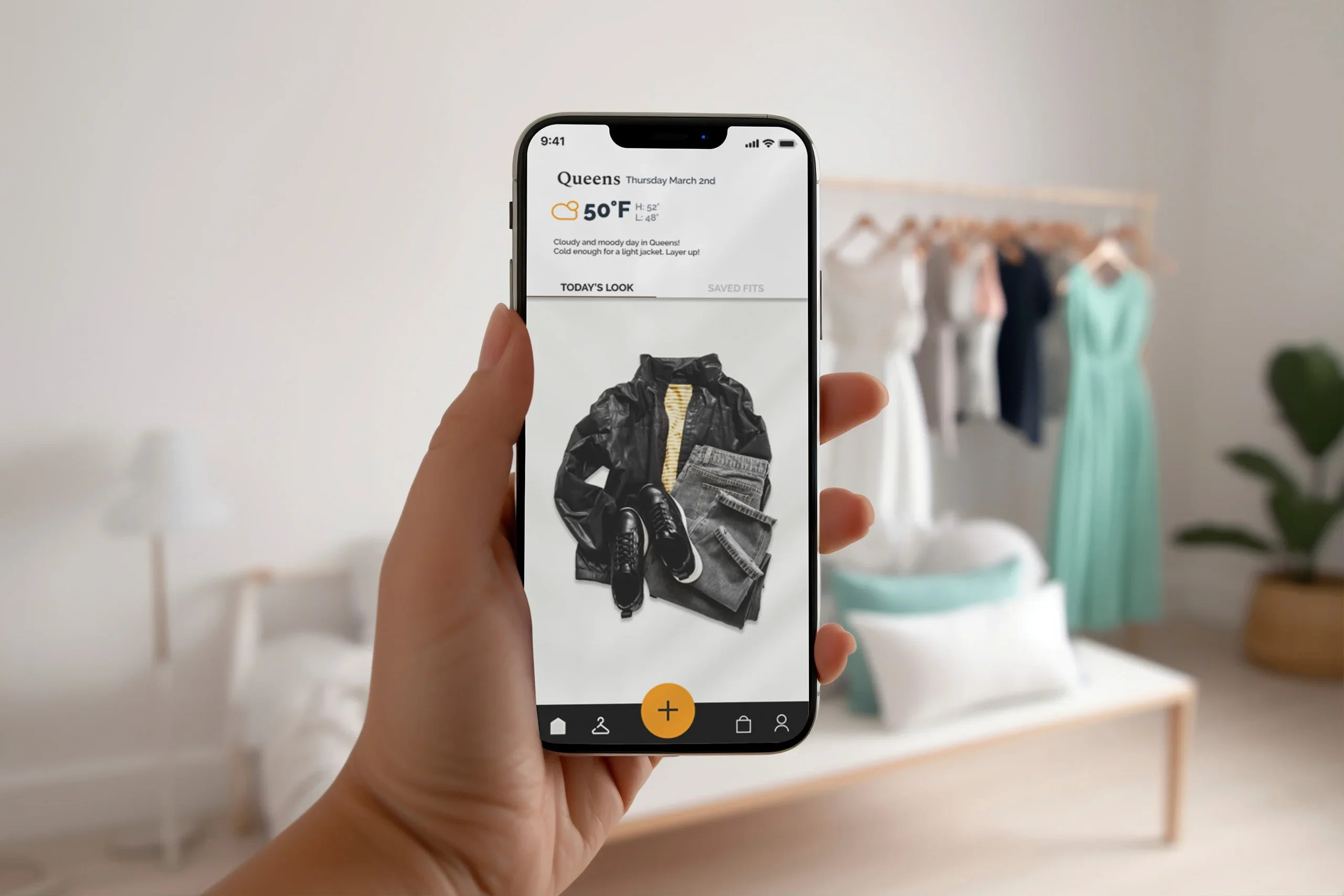
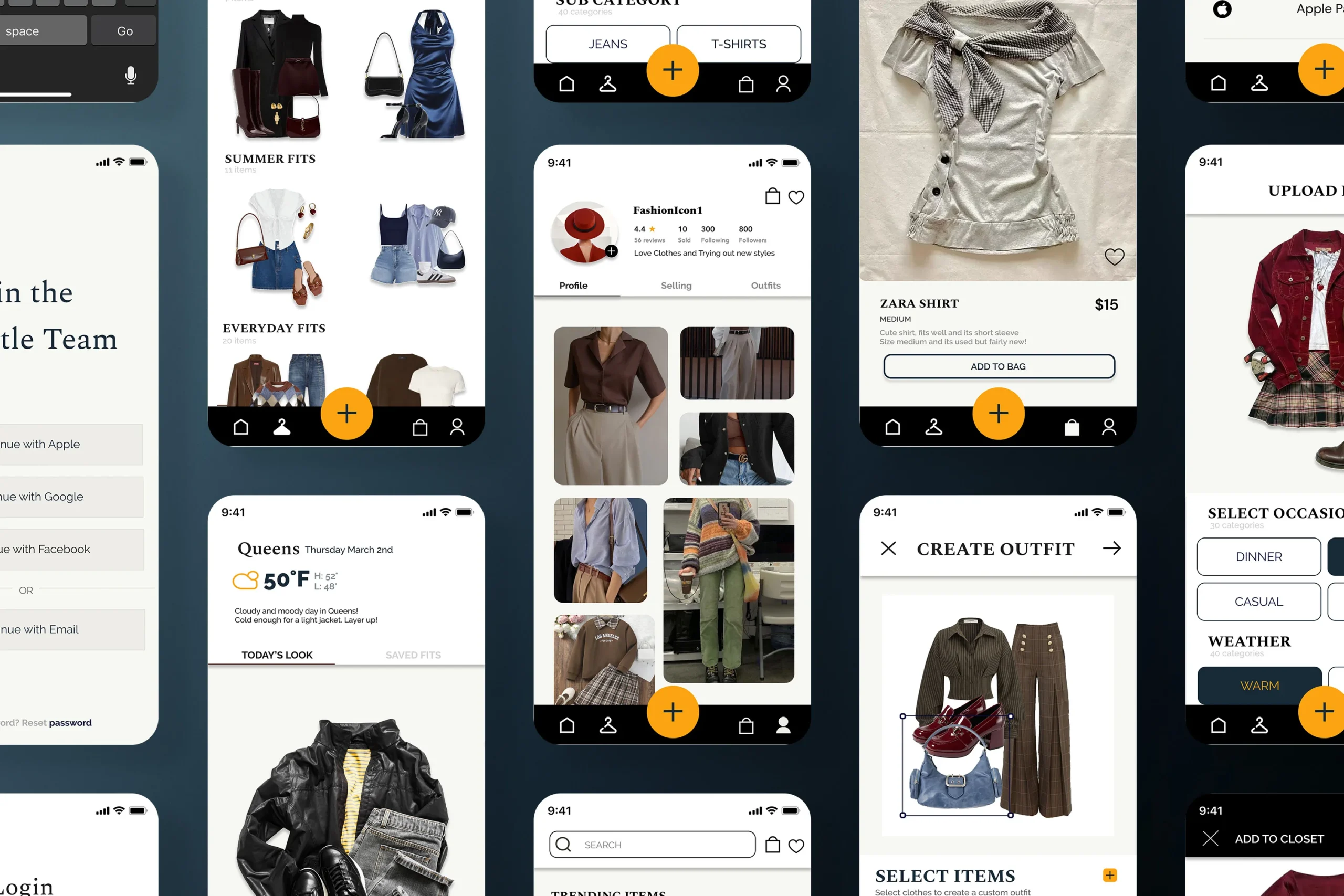
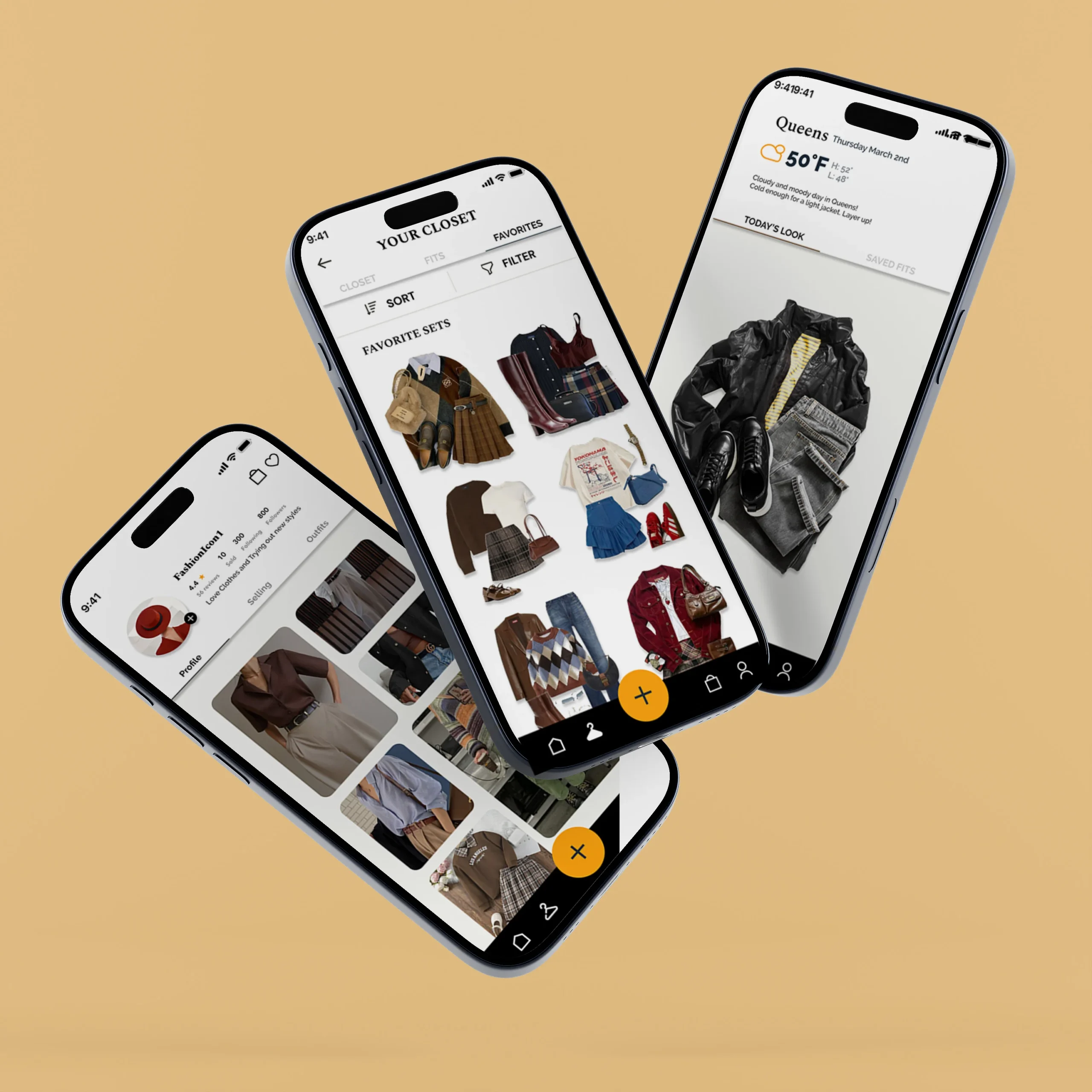
Homepage updates daily with personalized suggestions based on weather, past activity, and saved items.
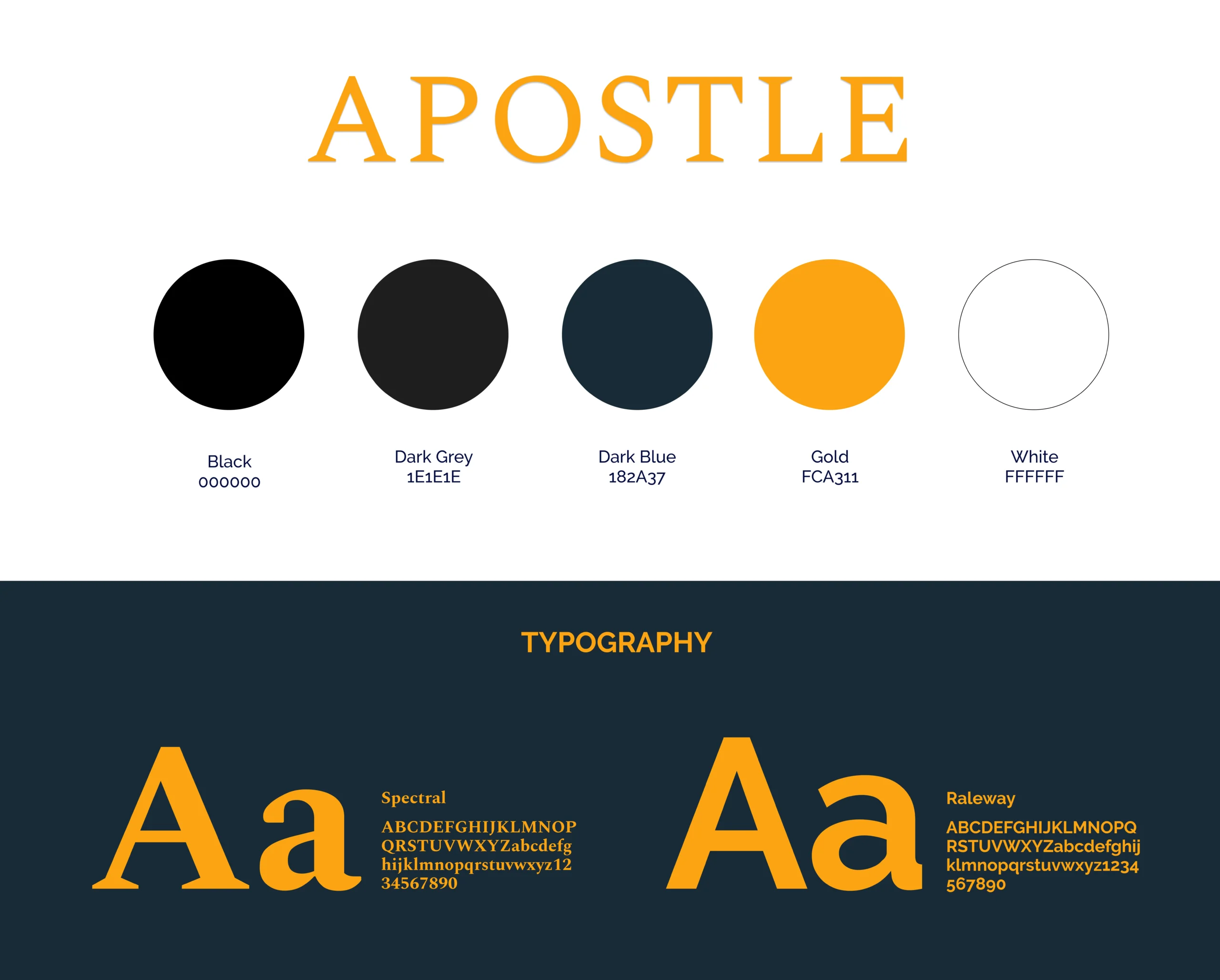
logo + visual imagery
