CLOCKED OUT
Visual Identity, PACKAGING, BRAND
Clocked out?
Focused on rebranding a company, I selected Two Chicks, a producer of sparkling canned cocktail drinks. Following a comprehensive brand procedure, I embarked on rebranding the company from scratch, introducing a new name, brand statement, logo, typography, color scheme, and packaging.
‘Clocked Out’ is my reimagined version, aiming to blend the sophistication of cocktail drinks with the convenience and enjoyment of a canned beverage.
THE APPROACH
THE NAMING
I decided on the name, “Clocked Out,” since I wanted to cater to young adults and adults after having a long day at work or school to crack open a sparkling canned cocktail drink and wind down.
BRAND
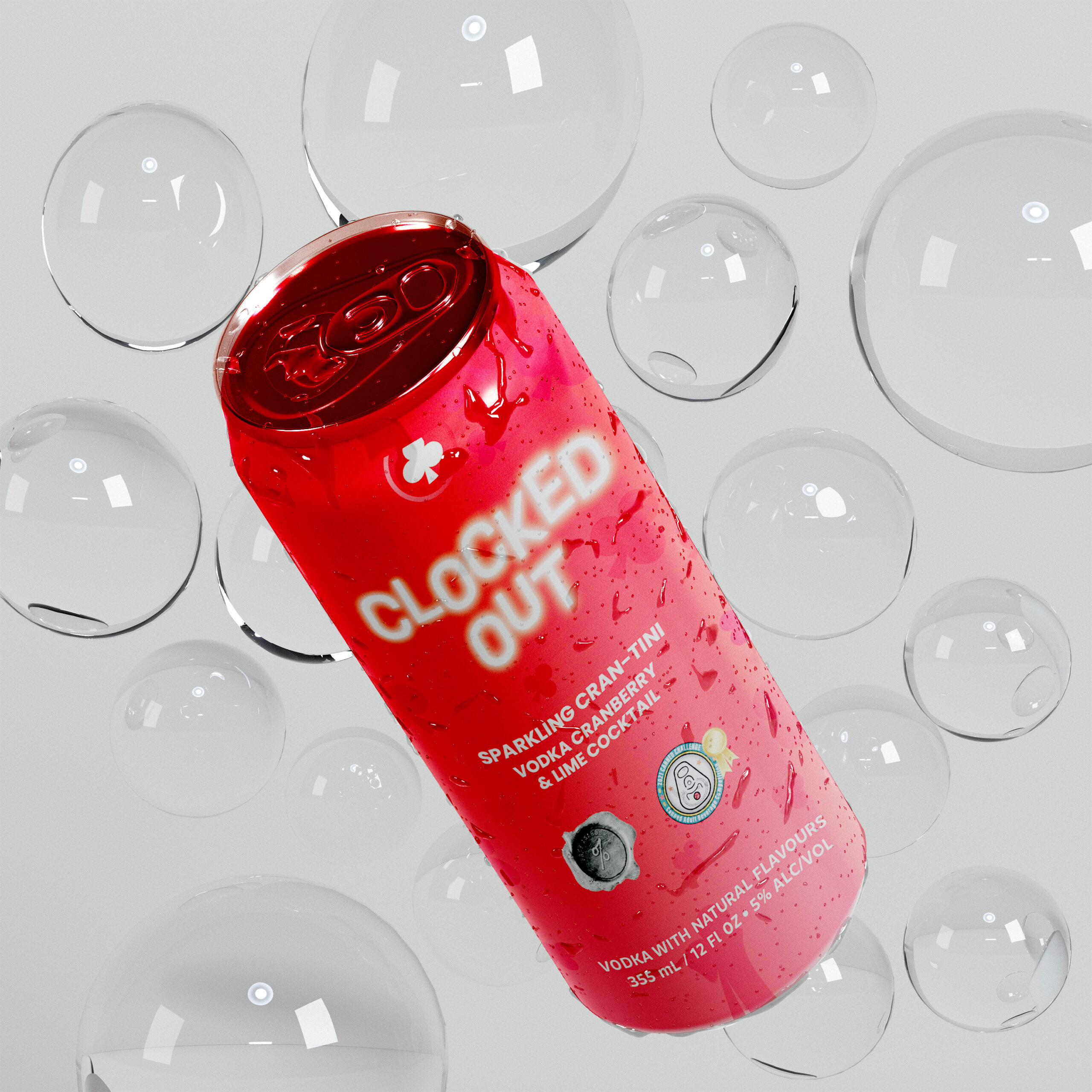
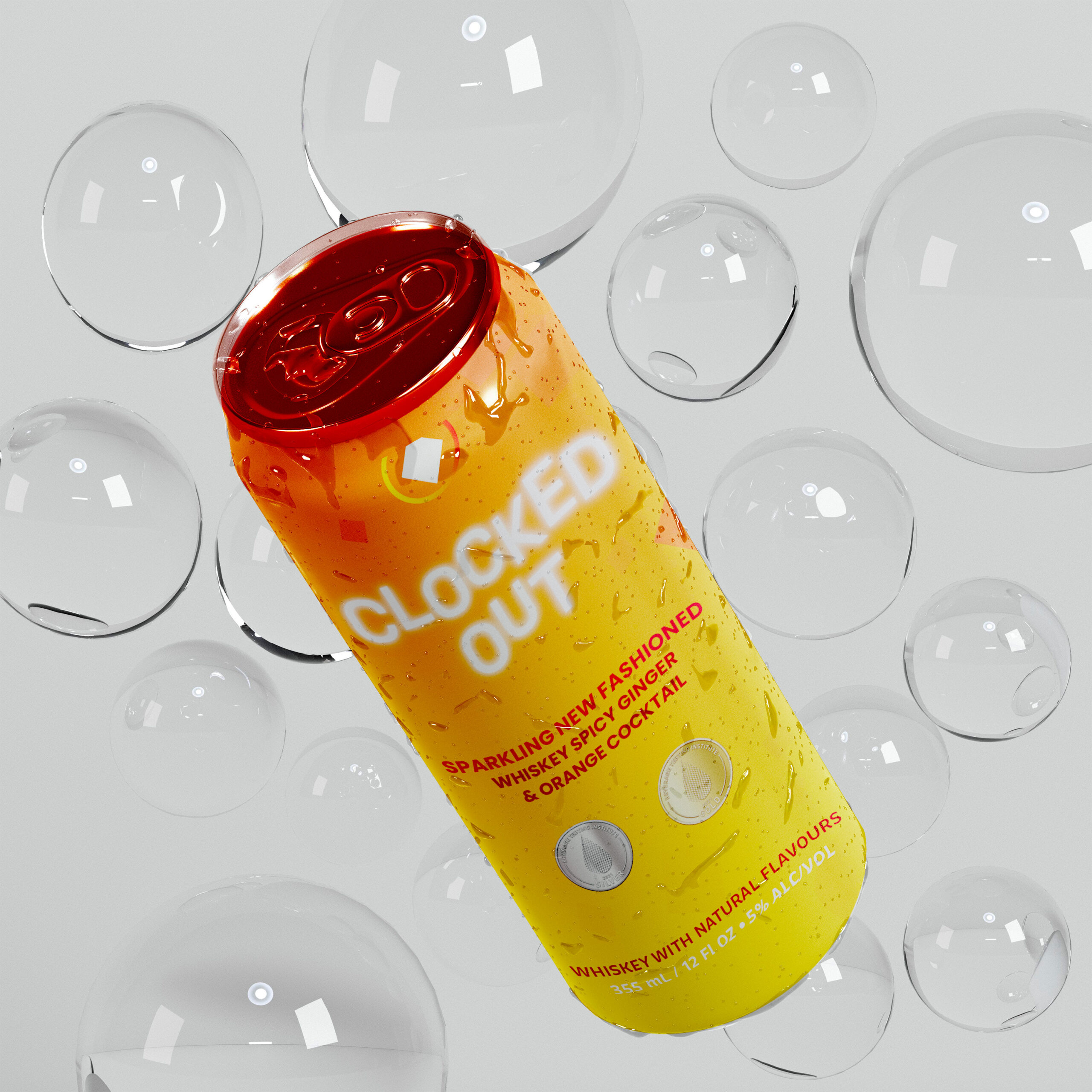
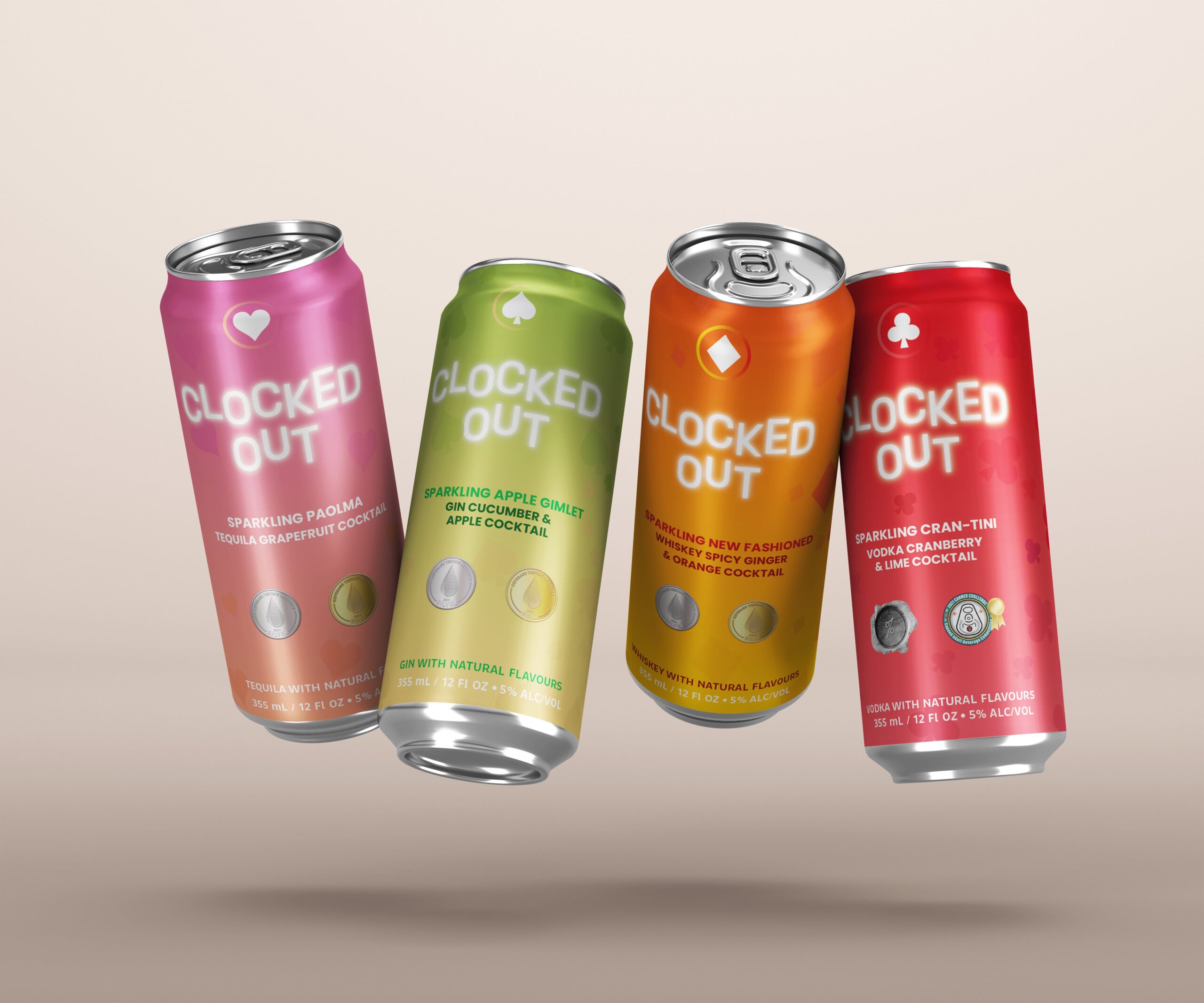
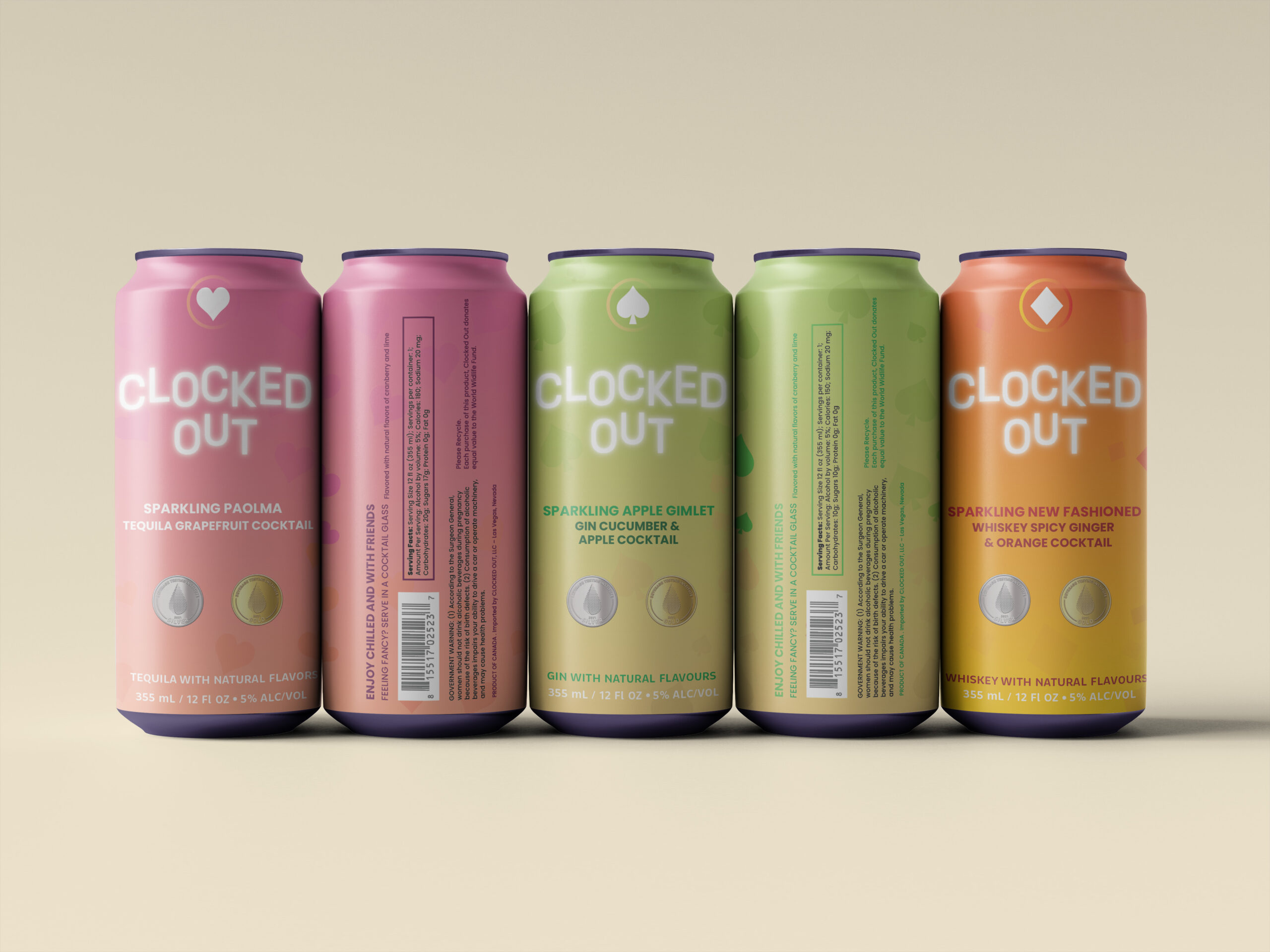
The brand focused on being fun, colorful, and catering to young adults. Each type of alcohol has different colors and different card symbols.
DIGITAL & PRINT PACKAGING
My plan was to create a brighter, more eye-catching design. While walking around the store, I saw the Two Chicks design and logo, but it didn’t catch my attention until someone pointed it out to me, prompting me to consider rebranding them.
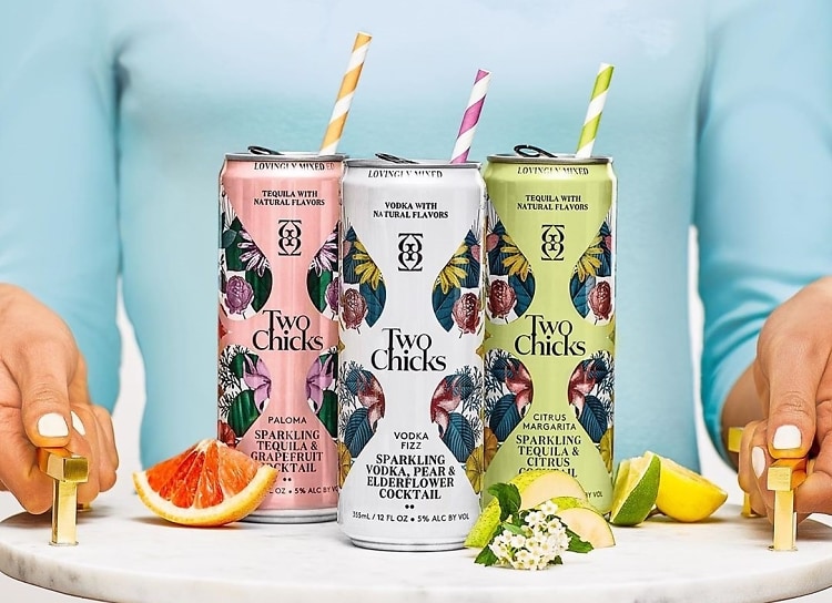
The first photo on top shows the original packaging of Two Chicks before I redesigned it as Clocked Out and the picture on the left, is the redesigned.
I decided to take inspiration from the colors of the drinks to create a gradient, and used a symbol from each playing card as a pattern in the background. Each type of alcohol has a different pattern. Additionally, I included the awards that each drink has won on the can. On the back of the can, there is a statement indicating that proceeds from each product sold will go to the World Wildlife Fund.
Pink is associated with Tequila, green with Gin, orange with Whiskey, and red with Vodka. Along with the symbols, hearts represent Tequila, diamonds represent Whiskey, spades represent Gin, and clovers represent Vodka.
